CHAPTERFOUR
Be focused and you will archive alot. choose your ON C#
Explore moreBe focused and you will archive alot. choose your ON C#
Explore moreLorem ipsum dolor sit amet consectetur adipisicing elit. Hic odit rem dolorum molestiae fugit deserunt exercitationem recusandae, itaque ratione harum sit repellat dolor temporibus deleniti non voluptatem nostrum quas? Cumque veniam, molestias id natus pariatur dolores aut nemo iure facilis expedita, temporibus exercitationem ullam ex officiis reiciendis quaerat enim consequuntur.
The box model is a concept that describes how elements on a webpage are structured.
Defines a division or section in a document (often used to structure content).
Specifies the display behavior of an element (e.g., block, inline, flex).
Positions an element to the left or right, allowing text to wrap around it.
The box model is a concept that describes how elements on a webpage are structured. Each element is a box with margins, borders, padding, and the content area.
* <div>:Defines a division or section in a document (often used to structure
content).
* display: Specifies the display behavior of an element (e.g., block, inline,
flex).
* float: Positions an element to the left or right, allowing text to wrap
around it.
* position: Specifies the positioning of an element (e.g., static, relative,
absolute, fixed).
* flex: A flexible box layout module that makes designing responsive layouts
easier.
* justify-content: Aligns items within a flex container along the main axis.
* align-items: Aligns items within a flex container along the cross axis.
* width: Sets the width of an element.
* height: Sets the height of an element.
* z-index: Controls the stacking order of elements.
* overflow: Controls what happens when content overflows an element’s box.
* flex-direction: Defines the direction of the flex container's main axis
(row or column).
<div style="display: flex; justify-content: space-between;">
<div style="width: 45%;">Content 1</div>
<div style="width: 45%;">Content 2</div> </div>
<div style="position: absolute;top: 10px; left: 20px;"> This is a positioned box.</div>
Responsive web design ensures that your webpage looks good on all devices, from desktops to mobile phones. It uses techniques like flexible grids, media queries, and responsive images.
* <meta>: Defines metadata about the webpage (used for mobile responsiveness).

* viewport: Defines the viewport for responsive web design.

* @media: Defines different styles for different devices or screen sizes.

* max-width: Specifies the maximum width of an element.

* min-width: Specifies the minimum width of an element.

* flex-wrap: Allows flex items to wrap onto multiple lines.

* media queries: Defines different CSS rules based on device characteristics.

* @media screen: Targets screen devices in media queries.

* @media print: Targets when the webpage is printed.

* width: Sets the width of an element for responsiveness.

* height: Sets the height of an element.

* rem/em: Units for responsive typography (relative to root element or
parent).
<meta name="viewport" content="width=device-width, initial-scale=1">
<style>
 body {
    font-size: 16px;
 }
  @media screen and (max-width: 600px) {
body {
font-size: 14px;
}
}
</style>
vildash network team has had alot of impact on others but here are the vildash network team testimonies and expirience while working with the team
you can now connect and text other users from our database. you just neeed to click bellow to message them
WE HAVE CODE EDITORS FOR LANGUAGES LIKE C, C#, C++, HTML, CSS, javascript, JAVA VISUAL BASIC
code with html CSS AND javascript all in one ide expireience the best
do your basic coding with c# with ease and learn how to use on building windows desktop app

you can now do basic programing on c++ and get to know how to use it on game or app developement

you can now do basic programing with c and see how to use it to program amazing embedded systems

you can now do basic programing with python and see how to use it to do multitask programing
you can now do basic programing with c and see how to use it to program amazing desktop apps

you can now do basic java coding and see how to use it on building a phone app
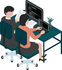
We dont just teach you to code we teach you to code and build amazing systems.we are group of expert who wants to promote our field of studies